Author: Brennan Sarich
One of the things I find most distressing as a communicator is a poorly designed website. Jumbled information, jarring colour scheme, and it looks like the brainchild of a three year old with too many fingerpaints. While it can be fun to make your website look like Geocities from the 90s, it’s a problem that has plagued us since before animated dancing babies and bleeding roses. Good communicators should pay attention to web standards, and one of the biggest developments in online visuals was the idea of Web 2.0.

What is web 2.0?
The concept Web 2.0 was developed around 2000, when web technology was really taking off. Social media was starting to become integrated in both business and personal life. Mobile phones and devices were becoming ‘smart’ also affected how communicators and developers thought about the web. People started asking ‘what is a good online experience, and how can we visualize that?’
Some highlights of good Web 2.0 design:
* The website is interactive and promotes social activity
* It sports colours and fonts that promote readability and usability
* Rich experiences of the website, regardless of whether using a mobile or desktop device. (ie. The mobile version of the site is not the ‘bad’ version of the website.)
A good example of popular website that employs web 2.0 is IMDB:
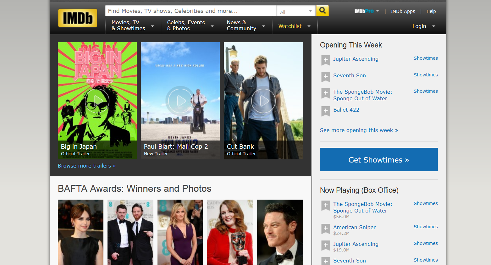
Trailers are large, with giant play buttons. Photos of celebrities are clear and headings are well organized. Sidebars display information relevant to users in bold text because a site about movies should be able to tell me which movies I should see. There is appropriate white space, making it easier to read text that it’s displayed on the page. And, of course, there’s a giant search bar at the top of the page, to help users find what they’re looking for.
Large websites like IMDB have spent a long time learning how to speak to their users, but that doesn’t mean that communicators can’t apply the same principles when building or redesigning a website.
Why do we want to use Web 2.0?
Coworkers and leadership may ask why you should focus on redesigning a website, especially if you have an existing website that currently is online. Here is a checklist to measure your site against:
* Does this website meet our brand standards? Does it speak to the target audience it was built for?
* Are we maximizing social media and online sharing opportunities for our brand?
* It is easy to use? Is information placed visually where users expect it to find it?
* Are there too many animations or graphical elements? Is there a way to create simpler, cleaner look? (If your site has animated pop-ups, it might be time to evaluate your priorities)
Web 2.0 is a big concept idea of how to visualize content. But the general principles of big visuals, a clean style, and a site that functions properly for your users should be your first priority as a communicator.
Brennan is currently teaching Visual Communications at Centennial College.